CSS3
the next version of CSS
CSS2 is "a specification"
CSS3 is "a collection of specifications"
Modules
- Selectors
- Box Model
- Backgrounds and Borders
- Image Values and Replaced Content
- Text Effects
- 2D/3D Transformations
- Animations
- Multiple Column Layout
- User Interface
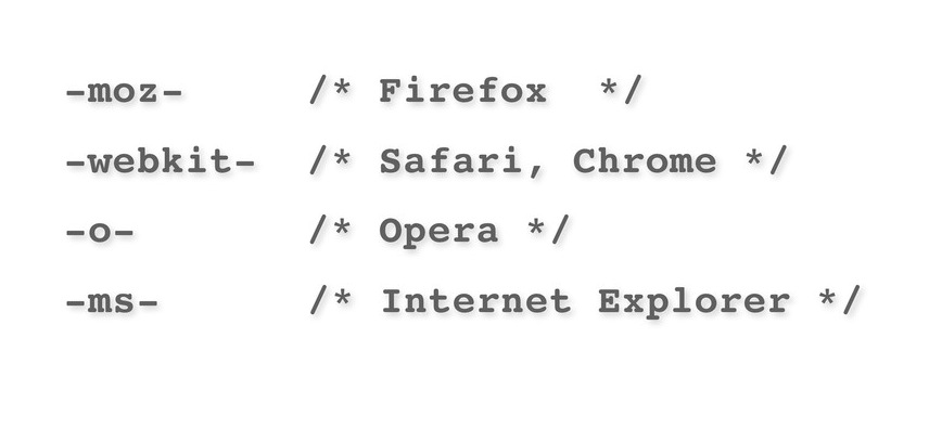
Browser Prefix
Selectors
↓
Basic Selectors
h1 {...}
.big {...}
#field_id {...}
* {...}
:hover {...}
.thing p {...}
new Selectors
- Attribute Selectors
input[type='text'] a[href ^="http://"] img[src $="png"]- pseudo-class Selector
  a:link a:visited
  input:enabled input:disabled input:checked
  li:first-child li:last-child li:nth-child li:only-child
  p:not(.box) p:empty
  p:first-letter p:first-line
  p:before p:after
  ul > li /* Child Selector */
  h1 + p  /* Adjacent Selector */
  h2 ~ p /*  General Sibling */
border
border-radius
img {border-radius: 200px;} /* same as width will be a circle */Backgrounds
That's Easy ...
background:url(tree.gif),url(flwr.gif);/* multiple background images */
background-size:cover; /* specify size of background images */
background-origin:content-box; /* defines positioning area of background */
Text Shadow
/* text-shadow: h-shadow v-shadow  blur color; */
   text-shadow: 0px       90px     10px orange;
Fonts
/* wow! it looks like a function ! */
@font-face {
  font-family: myFont;
  src: url(Motscroizes-Regular.ttf);
}

#fonts_example {
  font-family: myFont;
}
gradient
Linear Gradients
/* linear-gradient(direction, color-stop1, color-stop2, ...); */
#linear-gradient-example {
  background: -webkit-linear-gradient(left,red,orange,yellow,green,blue,indigo,violet);
  background: -o-linear-gradient(left,red,orange,yellow,green,blue,indigo,violet);
  background: -moz-linear-gradient(left,red,orange,yellow,green,blue,indigo,violet);
  background: linear-gradient(to right,red,orange,yellow,green,blue,indigo,violet);
}
Radial Gradients
/* radial-gradient(center, shape size,color-stop1, color-stop2, ...); */
#radial-gradient-example {
  background: -webkit-radial-gradient(center,closest-side,red,orange,...);
  background: -o-radial-gradient(center,closest-side,red,orange,...);
  background: -moz-radial-gradient(center,closest-side,red,orange,...);
  background: radial-gradient(center,closest-side,red,orange,...);
}
USE YOUR IMAGINATION
a demoTransformations
2D
#transform_title_2d_example {
   -webkit-transform: translate(100px,-30px) scale(1.5) rotate(23deg) skew(20deg, 142deg);
   -moz-transform: translate(100px,-30px) scale(1.5) rotate(23deg) skew(20deg, 142deg)
   transform: translate(100px,-30px) scale(1.5) rotate(23deg) skew(20deg, 142deg)
}
3d
#transform_box_3d_example {
   background-color: red;
   -webkit-transform: rotatey(-45deg);
   -moz-transform: rotatey(-45deg);
   transform: rotatey(-45deg);
}
USE YOUR IMAGINATION
a demotransition
Who? When? How? Duration? Result?
#transition_title_example {
  transition-property: transform; /* Who ? */
  transition-delay: 0; /* When ? */
  transition-timing-function: ease; /* How ? */
  transition-duration: 2s; /* Duration ? */

  transion: all 2s; /* Short hand */
}

#transition_title_example:hover {
   transform: rotatey(-45deg) rotateX(35deg) rotateZ(-10deg) scale(1.5);
}
USE YOUR IMAGINATION
a demoanimation
or like this?
@keyframes
@keyframes move {
  from {...} /* define start state */
  to {...} /* define end state */
  /* or */
  0%   { left:0px; top:0px; }
  25%  { left:450px; top:0px; }
  50%  { left:450px; top:450px; }
  75%  { left:0px; top:450px; }
  100% { left:0px; top:0px; }
}
Let's move
#example {
  animation-name: move; /* @keyframes name */
  animation-duration: 5s; /* duration */
  animation-timing-function: linear; /* Speed */
  animation-delay: 2s; /* when to start ? */
  animation-iteration-count: infinite; /* how many times ? */
  animation-direction: alternate; /* direction: normal, reverse, alternate */
  animation-play-state: running; /* state: running or pause */

  animation: move 5s linear 2s infinite alternate; /* shorthand */
}